
Could something as simple as the charts we use affect the decisions we make? Yes, according to our Visual Signals survey research.
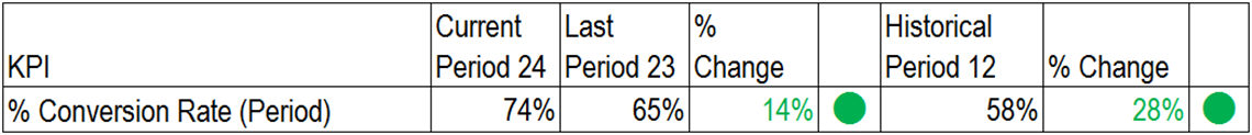
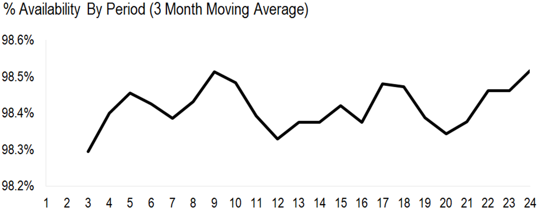
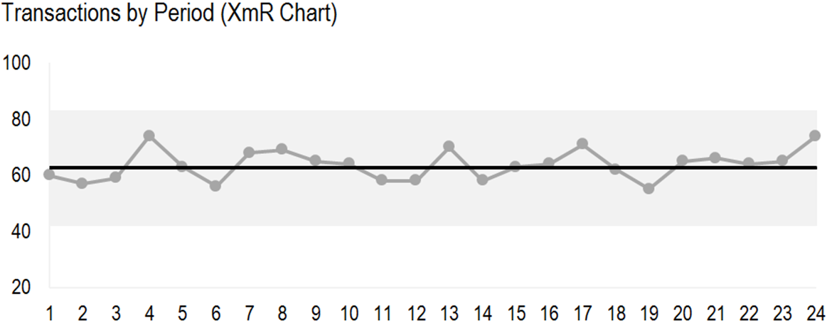
Survey respondents were shown charts for 4 typical business process KPIs and asked to decide in each case whether:
- Performance is GOING UP
- Performance is GOING DOWN
- Performance is staying THE SAME
They were also asked about their confidence in that selection and the effort needed.
Before reading on, why not take the quiz yourself here.
The 4 process KPI charts are reproduced below.

Results
The survey results are shown below. How do these compare with your own interpretation?
Findings (Spoiler Alert)
The type of chart affected the ability to detect a shift in performance.
The correct answer was ‘Performance is staying THE SAME’. The values in all the charts came from the exact same set of data from a stable process (described in ‘The Data’ below).
Using an XmR chart (see Shewhart Individual/Moving Range), the chance of making the right choice was about 70%, even where respondents were less confident in using it. With more familiarity, confidence might be expected to rise and effort to reduce.
For the Traffic Light and the Linear Trend charts, the probability of being correct was below 10%. The wrong answers were also diametrically opposite. For the Traffic Lights, ‘Going Up’ might lead to complacency. For the Linear Trend, ‘Going Down’ could lead to knee-jerk tampering.
The Moving Average chart was interpreted correctly in about a third of cases.
Implications
If we can’t detect true changes in our data, we don’t know what performance is really doing. If we don’t know what performance is doing we’re more likely to make bad choices; reacting when we shouldn’t or not reacting when we should.
If XmR charts were used routinely in management information then we might expect fewer interpretation errors. Perhaps fewer conflicts too. Our uncertainty would be reduced using trustworthy information and we become better decision-makers. Just by switching charts.
The visual design of management information is often overlooked when making claims about performance. As illustrated here, bad charts can contaminate beliefs and distort decisions. Our Decision Canvas designs make sure that any claims made about signals of change are closer to the truth.
Variability
The charts themselves can play visual tricks on us. However natural variability (common cause variation) can be a source of confusion too:
“A change in the numbers is not the same as a change in the system process which produced them.”
This concept can be quite hard to grasp. We feel a compulsion to attribute every change in the numbers to a specific cause. We routinely compare one period and another (financial results) or against a threshold (SLA targets). These limited comparisons of two numbers can lead us to over-react to randomness and under-react to true causes.
Statistical thinking and tools like XmR charts help us to separate true signals of change from random noise.
The Data
The stable process was simulated using a random number generator in Excel bound by fixed parameters:
=RANDBETWEEN(55,75)
This formula generates numbers with uniform probability between 55 and 75. Random sequences of 24 values were inspected visually in order to deliberately select one containing a potentially misleading pattern.
This sequence of values was then transformed in various ways to disguise the common origin.