
Should a person be rewarded or punished for a random event? I bet most people would say “No” and yet organisations do it routinely with their KPIs.
- What if the way numbers were used in board rooms, management and sales meetings, supplier and staff performance reviews were flawed?
- What if KPIs were fiddled and behaviour distorted because people were judged as failing in things over which they had no control?
- What if decisions were made because of noise in the data instead of a true signal?
Comparisons & Consequences
Organisations unwittingly make two mistakes: One is the comparison of two numbers and the other is imposing consequences on that comparison.
Comparing one number with another is easy so that’s what happens. We find out that one number is bigger or smaller than the other. Revenue vs. Target. Performance vs. SLA. This month vs. last month. This school vs. that school. Job done.
Causal Meaning
We then try to attach causal meaning to that comparison. “Oh performance was down this month compared with last month because …” or “This school is better than that school because …”.
If there’s one thing which heightens this need for a causal explanation it’s the prospect of personal, painful consequences; whether mental or material. This triggers an avalanche of attribution errors illustrated by this cartoon. Sales is a natural hotbed for this claim & blame game.

Randomness
But what if the thing we are measuring has no identifiable cause but arises instead from the intrinsic variability in a system? These comparisons and their consequences are now on very shaky ground. We still struggle to shake them off because of a very human trait: we don’t handle the concept of randomness very well.
From an early age we learn using causal mechanisms: ‘If I stop pedalling this bike I’ll fall off’. If something happened there must be a reason for it. These heuristics work for us in simple cases so we try and apply them more widely. The media reflects these mental shortcuts – ‘someone is to blame’ or ‘heads must roll’ – and the legal and insurance industries profit from them.
But randomness is everywhere; both as natural fluctuations in systems and error in the measurement of them.
Statistics
Rudimentary statistics tells us about the danger of inferring things from small samples and yet point-comparisons use just one. We know nothing about whether a number was produced by skill or sheer luck or how this is changing over time.
Taking a single sample and hoping that a comparison to another will mean something is hopelessly naive because it ignores regression to the mean. We don’t know where that number lies on a statistical distribution. But the more samples we take, the more likely that the average of those samples will be closer to the true performance of the system.
The first lesson we can learn is to simply stop to think whether attempts to make judgments upon such weak evidence are potentially flawed.
Shewart XmR Charts
Thankfully there’s an elegant visual tool which reveals these statistical shortfalls: an XmR chart.
XmR charts were invented by Walter Shewart in the 1920s, advocated by W. Edwards Deming and more recently Donald Wheeler. It pre-dates Six Sigma doctrine by decades but has been buried under its baggage.
It is one of the simplest yet best-kept secrets of performance measurement. Using a different type of chart may seem trivial but once discovered you can never go back.
Here is an example:
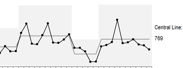
Instead of focusing on the individual data points we look instead at the patterns made by these points in relation to a central line and process limits denoted by the shaded region. A performance shift can only be claimed by applying clear rules for consecutive values either side of the central line. No central line shift? No performance shift.
We now have to surrender to the idea that values inside the upper and lower limits are a result of natural variability. Making claims or chasing explanations for variations inside the shaded region is low value effort. We only go looking for causes when individual values fall outside these ranges.
With an XmR chart we can stop knee-jerking to false-positives or overlooking false-negatives. Better still, we can predict future performance of the system with confidence and set targets which have a valid statistical basis.
If we want to truly shift performance or reduce variability we need to invest in systemic changes and then track the effects on the same chart. Beliefs, intuition, dodgy evidence and ill-informed debate have nowhere to hide.
Systemic Feedback
Good feedback is vital for learning and the improvement of systems. We should never wield the power of measurement in ignorance and judging people with flawed evidence is morally wrong.
We can stop listening to the noise which leads to faulty judgement and instead seek out evidence we can trust. If we use KPIs to point the finger of blame for failures we miss the chance to fix the system which produced them.