Stephen Few is respected for his unflinching critique of poor dashboard design and he inspired me to look at dashboards through a different lens.
I had this in my mind when I went to an Expo recently where there were over 30 software vendors jostling for attention. When you read the brochure-ware its hard to tell them apart. Could these tools be compared on their ability to effectively visualise the critical few measures that users need to make decisions and act on them? Are the software vendors enlightened enough to help you with this challenge or will they leave you exporting data to Excel in frustration once the novelty has worn off?
I’ve collected and critiqued a rogues gallery of 8 dashboards being demonstrated enthusiastically on vendor’s exhibition stands. I’ll concede that these displays could, I hope, be customised to alter the visualisations. I’m more interested though in how these products look when they come out of the box because:
- This is what vendors think is ‘good’ design and spend development dollars embedding in their products.
- This is what users will end up looking at daily unless they invest in doing something different.
Mr Few classifies 13 dashboard design pitfalls in all but here are the 6 most common sins:
- Sin1. Exceeding the boundaries of a single screen.
- Sin 2. Supplying inadequate context for the data
- Sin 3. Choosing inappropriate display media
- Sin 4. Ineffectively highlighting what’s important
- Sin 5. Cluttering it with useless decoration
- Sin 6. Misusing or overusing color
So here’s my assessment of the 8 dashboards with the sins they commit in brackets:
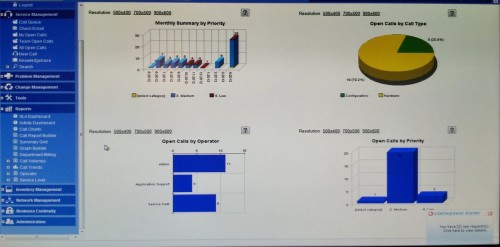
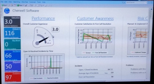
The most important display region of the dashboard should be the top left of the screen. This one has a navigation tree which isn’t the best use of this space and the dark blue of this panel draws the eye away from the charts themselves (4). There’s a huge amount of white space which, whilst useful for separating regions, is wasteful of valuable screen real estate which is probably why there’s a need for so much navigation (1)
There are 4 different chart types (3) most commit the sin of being in 3D which destroys comparisons, (5) one of which commits the cardinal sin of being a pie chart where rotational angles and areas are hard to evaluate (3). The bar chart bottom left is the best of the bunch but the bars aren’t sorted and there’s no good or bad context (2). In general the colours have no consistent meaning (6).
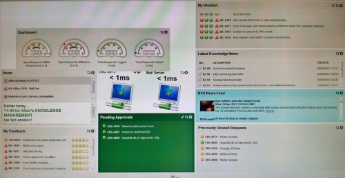
This one has different audiences in mind, most of the panels seem to be job lists for a service desk operator but we have also panels for SLAs and panels for service response time (2). The use of lists allows some density but provides very little context (2). As with many dashboards speedometers have been used as though a car-driving metaphor somehow adds more meaning. The meters waste space and are complex to read (3) and the traffic lights assume you aren’t colour blind and should ideally just highlight exceptions (6). The worklist in the top right probably has the most urgency for a user and if so should be positioned top-left (4). The PC icons are also wasteful of space and only offer a binary good/bad state when a variance from target or a time series would give more context (2). The dark green and cyan panels also draw the eye to low value data (4).
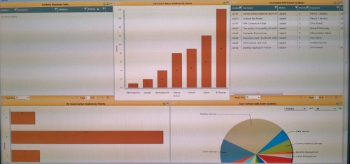
This example at least give prominence to the encoded data over decoration but we have fat axes on the charts (5) and a pie chart with an impossibly large number of part-to-whole pieces which aren’t sorted in any order (3) and multiple colours (6). One of the bar charts is a least sorted by value but there’s no target context (2) and the use of a red fill implies ‘bad’ (4 & 6). The panels could probably be resized but they make poor use of space and the region and table headers are distracting decoration (5).
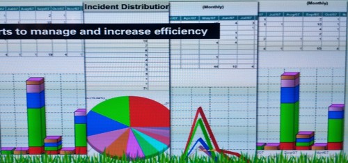
This is a collage of charts on a presentation slide which probably intends to illustrate how flexible the reporting is. Everything is in 3D (3), we have a busy pie chart (3) and the tables are superfluous because values are already encoded in the charts (3). The strong axes and grid lines don’t communicate any data (5) and all the charts have multiple colours which invite unwanted comparisons between them (6).
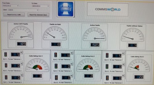
This dashboard suffers from too much embellishment; the designs of the speedos, traffic lights, meter panels and borders draw the eye but don’t communicate any data (5). The white on black meter font is hard to read and could be combined in a single visualisation such as a bullet chart with an integral target rather than using a separate traffic light (3). The dense layout make good use of the display space but the most valuable screen real estate is taken up with a filter panel and logos (5).
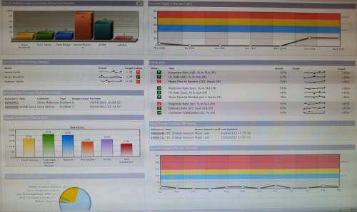
This dashboard has a few things to commend it; the use of sparklines (microcharts) in the tables provide time series context without taking up too much space although the time periods are unclear. Because the sparklines have embedded targets, the boxy up/down arrow boxes are a little unnecessary but the red icons do draw attention to the Critical SLAs in breach. Since this also seems to be the most important summary information it should be positioned top left with the other information grouped more logically eg. 7 day/12 month request volumes together, category comparisons together.
Unfortunately the other visualisations exhibit several pitfalls, especially the use of multiple chart types for similar categorical data, 3D effects, shading effects and a pie chart. Sadly, a well-intentioned attempt to show performance over time in context with target bands fails because the red shading is too dominant, giving the impression that something is in ‘critical’ state even though the signal is normal. Because of the wasteful size of these charts, these red bands dominate the dashboard.
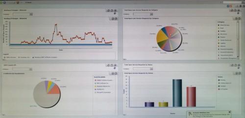
Whilst this display in generally quite pleasing to the eye we have multiple categorical chart types and pie charts (3), 3D & shading effects (5) and seemingly random use of colour (6). The size of the panels and the filters/controls take up valuable screen estate which would also imply additional that drilldown & navigation is required (1). In the top left chart the time series axis labels are unreadable and the data point markers obscure the patterns in the data with red points implying ‘bad’ (6).
There’s some logic in putting a user’s high priority information panels at the top left of the screen but presumably a drill down is needed in each area to give context (1). These values would have much more meaning if some comparison could be made visually against target or over time with a sparkline. The display space usage is generally inefficient and the meter in particular takes up a lot of space and is less effective that say, a bullet chart (3). The charts are in 3D with a shaded background and strong gridlines (5).
In summary, and rather worryingly, I didn’t see a single tool which had put Stephen Few’s wisdom into practice. What does this mean for organisations? Bad dashboard and report design impairs the reader’s ability to rapidly analyse and interpret data in order to make better decisions and monitor the effect of actions. Using the default, wizard-driven visualisations in tools are potential barriers to acquiring the evidence, meaning and insight needed to get a return on investment from the software.
Performance measures should be deliberately defined and visualised to drive the right results for a particular audience.
Dashboards should be customised as far as possible to address these pitfalls or built using more visually-capable Business Intelligence tools.
Unless software vendors wake up to visualisation as a potential differentiator in otherwise mature markets, more investment and effort will be needed by organisations to effectively communicate meaningful measures and execute performance improvement.
Trust Your Dashboards.
If you want dashboards and reports you can trust, you can start with an easy experiment: Translate your existing management reports into a visual prototype.
A Visual Management Pack is a quick, practical exercise – one of our Visible Sprints – and only takes a couple of weeks. You could even have something ready for your next leadership meeting.
If you want to set up a discovery call to explore the idea of a Visual Management Pack then get in touch.
