I saw Volkswagen’s digital dashboard for the first time recently.
The Active Info Display, according to the manufacturer’s website:
‘lets you see important information at a glance, without taking your attention from the road.’
I don’t know what gets the pulse of a VW Passat buyer racing, nor am I a Human Factors or In-Car UX geek. But I am very interested in how the visual design of information can improve decisions. And people who drive cars make decisions too.
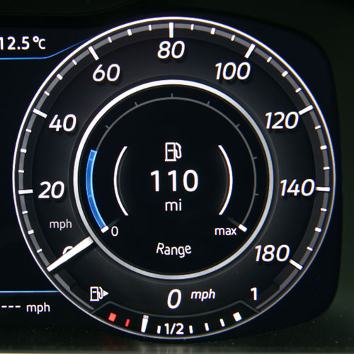
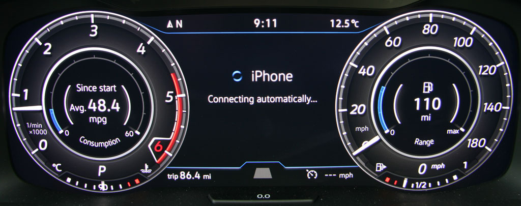 The Active Info Display looks exactly as you would expect a car dashboard to look, right down to the life-like rendering of the dials and needles. It mimics near-perfectly the physical dashboard in digital form.
And that’s the problem. Why should the visual design be constrained by a decades-old physical dashboard paradigm? Long gone are the days when a rotating magnet spun a needle around a dial.
I’m no digital-fetishist, but a high resolution digital display is a blank canvas, begging for a visual design which redefines the dashboard concept. I can understand VW wanting to gently nudge loyal customers towards the future whilst rebuilding post-emissions trust. But iconic design, like trust, was once a core value of the VW brand too.
A bit of rudimentary research into contemporary information visualisation would lead us to Colin Ware, Edward Tufte, Stephen Few and others. They caution against busy embellishment, rotational dials, bright colour and animation. With good reason too. These elements make our visual faculties work harder and distract us from the job in hand: in this case driving. Yet here these elements are, on the digital dashboard of a car.
I would think that one way to keep more of a driver’s attention on the road would be to design a dashboard that doesn’t invade and consume their attention. The design brief for this alternative dashboard would demand pre-attentive visual processing rather than aesthetic or nostalgic appeal.