Have you ever played Dobble? Its a brilliant game; infuriating at times but fun. It turns out we can learn a lot from Dobble about how to make faster decisions using charts.
The basic idea of Dobble is a race between the players to spot matching pictures on a pair of cards.
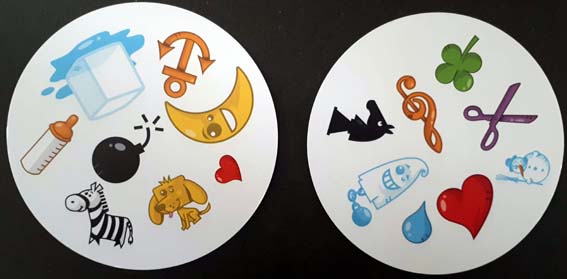
There is always just one match amongst the 8 symbols on each card, but finding that match is surprisingly hard. The brightly coloured pictures on each circular card can be in different sizes, positions and rotations.
Here’s an example pair of Dobble cards. How quickly can you find the matching symbol and then say it? It usually takes a few seconds.
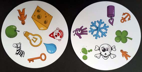
The effort to find a match has a hefty cognitive load. Our eyes and brains attempt a visual search strategy, flitting between the cards. A methodical search might select a picture on one card and compare it with each picture on the other. Up to 63 failed comparisons could be needed before a final match.
Just seeing a match isn’t enough though.
Even after finding one we then have to translate the symbol into a word and shout it out before another player. This can lead to arguments about who got there first.
This throws up a curious insight into how visual design affects the speed of decision making.
Dobble deliberably obscures our pattern-matching skills to create its gameplay. Making visual perception more effortful slows down our decision about which word to shout out. It forces us to waste brain attention and time translating the visual stimulus into a useful form.
Whether intentional or not, we do this to ourselves with our attempts to consume information, whether in words, in numbers or in poor charts.
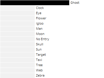
Now, how about using this bar chart?
This chart simply counts the number of pictures on each card. Most will just be counted once but the matching symbol will be counted twice. Plotting the matching symbol as a longer bar with more intense shading makes it very easy to detect. This happens pre-attentively with virtually no cognitive load.
Our eye also tracks to the end of the bar to find a label. There’s no need to translate a shape into words and we can say it out loud almost without thinking.
This is a very direct illustration of how even a simple visualisation can help us to reduce the time and effort needed to consume evidence and declare a decision. The data on the Dobble cards and the bar chart are the same, but the chart has far higher value for reducing the decision time.
Now look at these examples.
Example 1

Example 2

Example 3
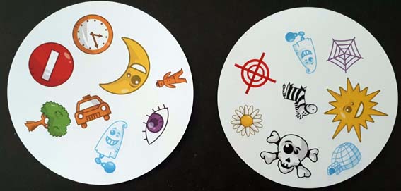
Were you drawn to using the bar chart to find the answer? Is your brain now rewired to seek out the lower effort shortcut? Did you double check the answer on the Dobble cards?
The investment made in creating the chart keeps on giving too. Other players can now consume it in preference to a higher effort comparison. Attentional waste is reduced and everyone arrives at a consistent, equally rapid decision.
No effort, no arguments but, admittedly, not as much fun.