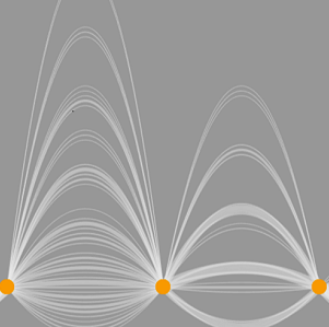
A Jump Plot is a neat visual way to illustrate the variability in elapsed time between events or steps in a process.
This is in effect a ‘stacked’ linear directed graph taken to new heights by visual designer Chris DeMartini.
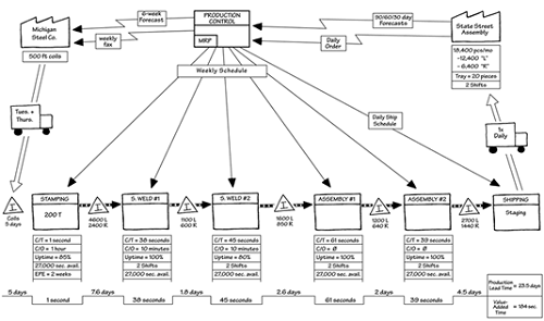
Here is a an example of a traditional Value Stream Map:
Replacing or augmenting the ‘notched’ timeline from a VSM with a Jump Plot introduces a visible sense of the variability in Value-Adding and Non-Value-Adding time, which in this case could be illustrated above and below the timeline.
Jump Plot (Tom Van Buskirk and Chris DeMartini) / CC BY 4.0
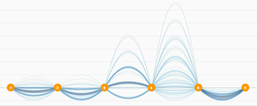
The nodes and edges in this flow could be used to further encode process data such as queue lengths or availability. An XmR chart directly below each node could also show the behaviour of variables which are the current focus of improvement efforts.
See more examples at jumpplot.com.