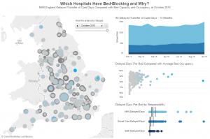
A common media topic over the winter months is the increased pressure on the NHS coupled with the snappily-named ‘Bed-Blocking’; patients who are well enough to leave hospital but are still occupying a bed. We might see this attributed to a ‘crumbling adult care system’ caused by ‘sweeping cuts to local council budgets’. Is the cause really so straightforward?
This visualisation links the NHS England Delayed Transfer of Care to Bed Capacity data for the last 13 months to seek new insights. As with many things in the NHS, the picture isn’t as simple as the media sound bites would suggest.
Click on the image below to launch the interactive dashboard on Tableau Public:
The distribution of Transfer of Care process delays and bed occupancies vary by individual Trust within the Local Authorities they serve. Some are improvement bright-spots, others aren’t. The creation of metrics for ‘Bed-Blocking Pressure’ and ‘Bed-Blocking Effect’ produces geographic Trust ranking.
This is just one example of how we can use visual analytics to explore patterns in your data for better decision-making.
Get in touch to find the stories hiding in your data.
Caveats : There’s still work to do on the geocoding of some Trusts and the use of historical bed capacities/occupancies instead of just the most recent quarter. We could try and factor-in the higher occupancy units. We’ve created a separate drill-down into the Delayed Transfer of Care root causes which reveals insights for combined Local Authorities & Trusts. Get in touch if you’re interested.

