Everyone has something they call a dashboard don’t they? As long as there’s a display full of pretty traffic lights and speedometers then the dashboard box is ticked. Or is it?
Certainly not according to Stephen Few, the author of beautiful reference books on the art and science of data visualisation.
Few is an evangelist for giving data meaning through visual communication and I’m a long standing disciple. In his book ‘Information Dashboard Design’ (now its second edition), he defines a dashboard as the:
Visual display of the most important information needed to achieve one or more objectives which fits entirely on a single computer screen so it can be monitored at a glance
That’ll do nicely Stephen.
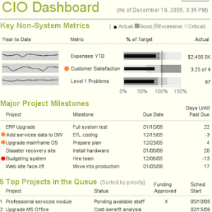
He critiques examples of dashboards which, whilst you’re still uninitiated, don’t look too bad. By the time you reach the end of the book you realise that they were truly awful. Poor choice of colours, inappropriate visualisations and non-data pixels are the most common faults. Logos, pie charts and gauges in particular get some stick. Some of BI tool vendors are culpable but the greater culprits are the analysts using their products to create visual monsters.
As well as explaining preattentive processing and the Gestalt principles of visual perception, Few describes the display media which are most useful for dashboards. Summarisation and exception are two key design characteristics; summaries create an aggregate perspective which prompts further questions whilst exceptions, and implicitly the underlying thresholds, draw attention to variations from normals and targets.
Customising a dashboard for the audience, their objectives and how they will act on the information is also crucial in deciding on the content. This is where KPI design and visualisation design converge in a very cerebral, iterative and often-overlooked process.
I’m often involved in extracting and visualising data from technology and service management tools. These could be the tools which sit there logging data day in, day out, but are often relegated to an operational notification function. Yes, you can produce traffic lights, charts for usage and print huge lists of stuff but how are you going to use this, er, noise to improve something the customer values? Some tools may be better at providing reporting but still suffer from the visual bloat which gets in the way of meaningful communication.
Instead of wrestling with the native visualisations that management tools provide sometimes it can be useful to re-evaluate what’s really important about the information being communicated and work harder on those ‘critical few’ KPIs and how best to visualise them in a way which helps the audience make better decisions.
I apply Few’s techniques everywhere I can. They sit squarely at the intersection of my professional passion for analytics and a personal interest in aesthetics and creative design.
I highly recommend his books if you’re working in this area and his website has lots of useful resources. His closing remarks inspire us to design a dashboard which:
makes people’s lives better, helps them to work smarter, or gives them what they need to succeed in something that is important to them
As a purpose, there can’t be many more worthwhile.