
This chart has been served up on LinkedIn recently and will no doubt have data visualisation purists choking.
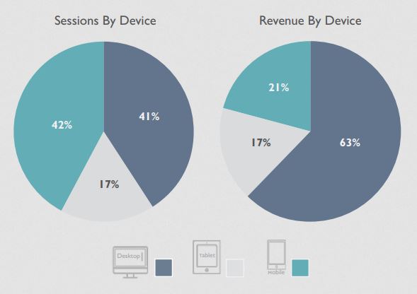
I tracked down the original to this publication by Wolfgang Digital. The story the visualisation is trying to tell is that:
“More revenue is carried by internet sessions on desktops than on other devices.”
However because of the chart type and other design choices we have to work a lot harder to get to this message than we need to.
Pie charts are notoriously poor for making comparisons because humans can’t easily compare rotational angles or areas. In this case the designer also wants us to compare categories across two pie charts, sessions vs. revenue. We are then forced to look up the categories using both the cute device icons and coloured keys.
Trying to link these variables in our heads imposes a hefty cognitive load. Crucially, under its weight, the central message is obscured.
Here’s our alternative:
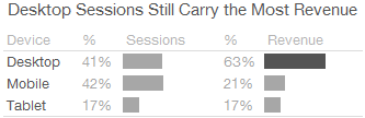
This type of visual design might not look as sexy but it doesn’t get in the way of the story that “Desktop sessions carry more revenue”. We can subtract the pie charts, colour, legends and yet amplify the key message.
This shifts the role of the visualisation away from marketing eye-candy towards management decision-making. We consume the chart with more natural visual perception and rapid insight.
The biggest un-answered questions are how these proportions are changing over time and the distribution of sessions and revenue by purchase type. We also might want to know more about the source of the sampled data.
Minimal panels like these can pack a lot of decision signals onto a single screen or page and dispense with noisy ‘chart junk’. Most data visualisation and dashboard tools can be applied to this task to overcome the lazy defaults. We just have to make a conscious effort to stop software tools dictating the style of our visualisations, especially when they impose poor design choices and visual bloat.
At Measureology we often prototype in Excel and then use Tableau for production dashboards with virtually no change in how these are displayed or interpreted. But we’re not precious about Business Intelligence, dashboard and reporting tools as long as they can cut the visual mustard without a bellyfull of pies.